PROJECT: Twenty-five years ago a small, passionate group of women from Hadassah created a foundation to increase female political representation, confront gender-based violence, and empower women and girls in leadership roles. Although the Foundation was a separate entity from Hadassah, there was some crossover and a decision was made to mirror the larger organization's visual identity.
As the silver anniversary approached, the Foundation understood that they needed to differentiate themselves, raise their profile, and more accurately reflect their mission in an ever-changing geopolitical landscape.
Project Scope
Brand Strategy
Brand Identity
Brand Standards Guide
Messaging and Copywriting
Digital and Print Collateral
Email and Social Marketing
Web Strategy, Design and Development
Project Scope
Brand Strategy
Brand Identity
Brand Standards Guide
Messaging
Business Papers
Digital and Print Collateral
Email and Social Marketing
Web Strategy, Design and Development
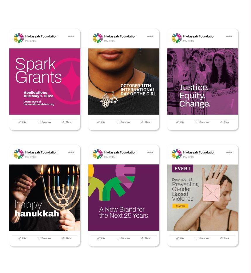
WHAT WE DID: We worked with the Foundation team to clarify their position, shifting focus from the funders to their grantees. This gave the Foundation a way to explain their work and be acknowledged as a partner to visionary organizations that fight gender inequality in Israel and the United States.
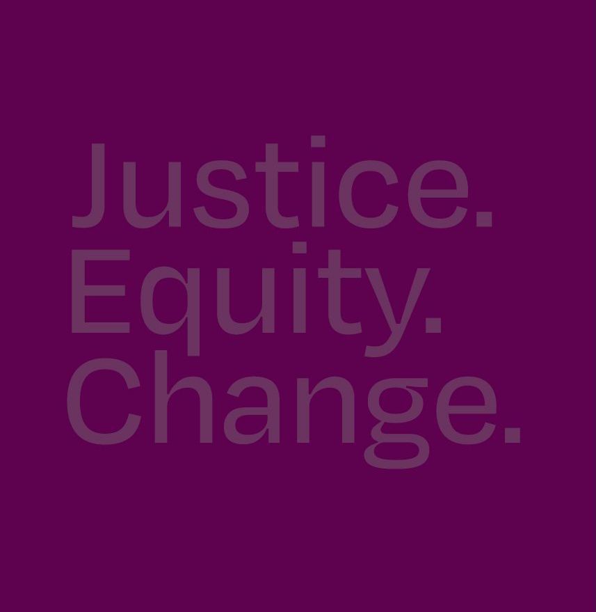
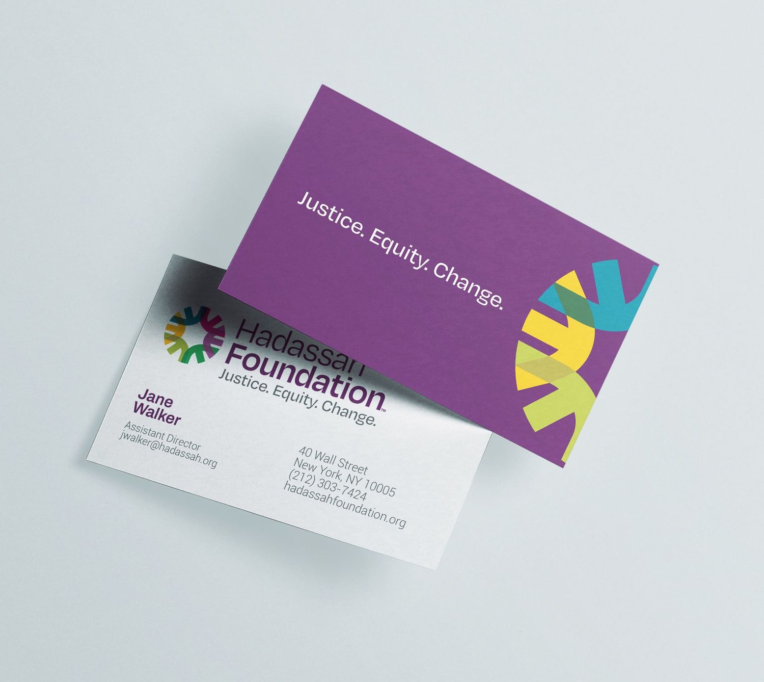
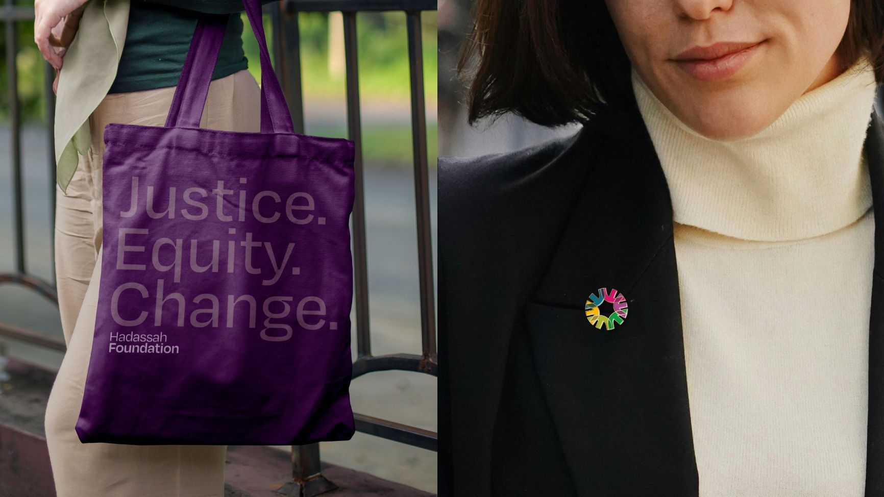
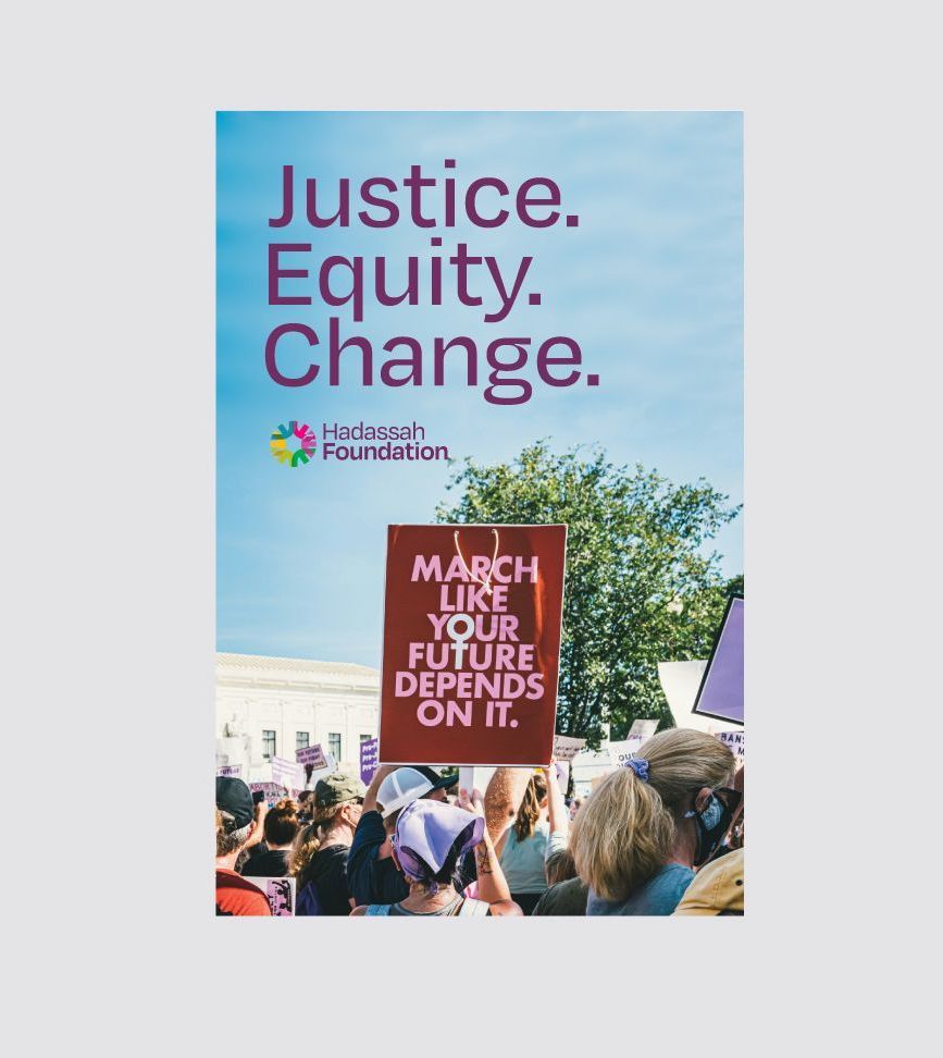
We then developed a new tagline that clarified their important work right up front: Justice. Equity. Change. Visually, we felt it was important to move away from the strident black/red of the original logo, and incorporate a more diverse, positive visual identity that could reflect the Foundation's supportive approach to funding.
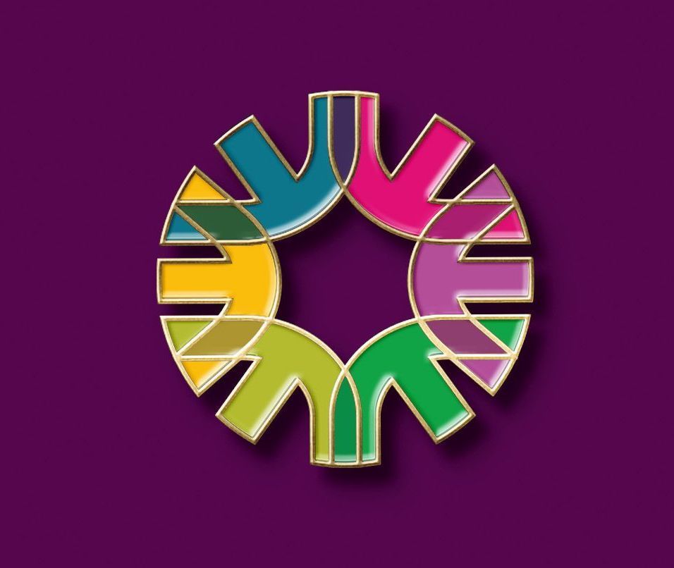
The new brand is built on a series of overlapping organic shapes that create multiple possibilities for use through a complete toolkit of brand assets.
Celebrating the power of women to create a more equitable and just world.
2024 All Rights Reserved | Dosido Design